A fancy product comes always with tricky features. Implementing the interactive 3D map view for the Flugrouten-Radar has been a chance to deal with new techniques involving Javascript, CSS 3D Transforms, map projections and more. Let’s walk through gotchas and solutions.
From prototype to features
Luckily enough, we didn’t have to start from scratch.
ProPubblica, who designed the first prototype, provided us with their source code. Despite being an initial implementation, it was already addressing the basic functions. Here it is a comparison of the 3d view prototype vs the final version:
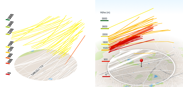
To our surprise, the 3d effect was done entirely via CSS3. Each trace was a canvas created using Raphaël, while the bottom ground was created via the Google Maps static service.
It came with an automatic isometric rotation feature, rotating the view on mouse move, independently of the mouse position on the screen. More important, most of the projection code needed for generating the SVG canvas has been already written and put in places. We just had to generalize it, fix it a bit and incorporate it as a helper library, allowing us to get vector lines with the correct projection (Mercator), size and zoom level based on simple coordinates.
How it works
The prototype looked fancy, yet incredibly easy in its principle.
First, stack absolutely positioned layer one on top of each other. This is as simple as:
<div class="asf-3d-chart-container">
    <!-- Ground layers -->
    <div class="asf-3d-map-layer-ground"> .. </div>
    <div class="asf-3d-map-layer-ground"> .. </div>
    <div class="asf-3d-map-layer-ground"> .. </div>
    <div class="asf-3d-map-layer-ground"> .. </div>
    <!-- ect… -->

    <!-- Traces' layers -->
    <div class="asf-3d-map-layer"> .. </div>
    <div class="asf-3d-map-layer"> .. </div>
    <div class="asf-3d-map-layer"> .. </div>
    <div class="asf-3d-map-layer"> .. </div>
    <!-- ect… -->
</div>
and then, CSS-wise (or better SCSS, to be precise):
.asf-3d-chart-container {

  // This is the size of the stacked layers
  $pathTileSize: 380px;

  position: absolute;
  width: $pathTileSize;
  height: $pathTileSize;
  bottom: 0;
  left: 0;
  right: 0;
  margin: 0 auto;

  .asf-3d-map-layer,
  .asf-3d-map-layer-ground {
    position: absolute;
    top: 0;
    right: 0;
    left: 0;
    bottom: 0;
  }
}
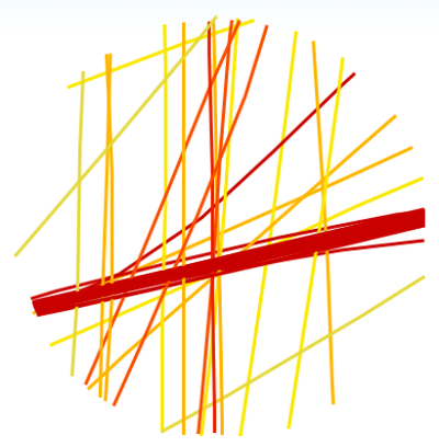
This is the result:
3D Transforms magic
3D Transforms allow you to manipulate DOM elements like planes in a tridimensional space. As most CSS properties, those are ihnerited by an element’s children, which means that for our purpose it is enough to rotate the container:
.asf-3d-chart-container {
  // …
  @include transform(rotateX(57deg) translateZ(-80px));
  // Rotates the map and pushes it to the bottom of the container
  @include transform-origin((center center 0));
  // Specifies the pivot for the transform to be at the bottom-center
}
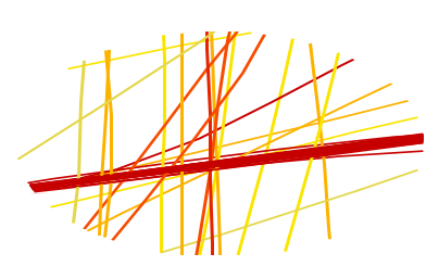
That was easy. Now it’s time to space the lines vertically.
This is done dynamically in our Backbone-view during plotting. The complete process of rendering the SVG is a bit complicated to be explained briefly. For now is enough to know that at some point something like this happens:
renderTrace: function() {
    …
    $layerContainer.css({
        transform: "translate3d(0,0," + layerHeight + "px)"
    });
    …
}
Where $layerContainer is one of our jQuery-wrapped divs with class asf-3d-map-layer and layerHeight is a normalized measurement in pixel calculated upon the height in meter of the trace relative to the max-height we want to achieve. This ensures that each layer has an appropriate Z translation value, e.g. translate3d(0,0,20px).
However in order to see the effect, we need to add an additional CSS-property to the container:
.asf-3d-chart-container {
  // …
  @include transform(rotateX(57deg) translateZ(-80px));
  @include transform-origin((center center 0));
  @include transform-style(preserve-3d);
  // Enable childrens to be stacked vertically
}
preserve-3d is absolutely necessary for the Z spacing to be rendered correctly. What it does, is specifying that the DOM element is by all means a 3d projected viewport. If not specified, Z distances will be ignored.
IE Note: at the time of writing, preserve-3d is still not supported by any version of IE explorer (<= 10)
This is the result:
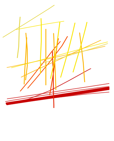
We are close! But as in the prototype, this is still isometric, let’s add perspective:
.asf-3d-chart-container {
  // …
  @include transform(rotateX(57deg) translateZ(-80px));
  @include transform-origin((center center 0));
  @include transform-style(preserve-3d);
  @include perspective(8000px);
  // If the browser supports it, enable perspective
}
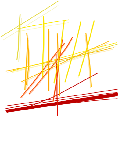
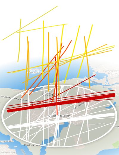
The effect cannot be appreciated sensibly on a still image but it looks much more natural during rotation. In order to make the effect visible here it’s a screenshot blended with the isometric version:
Additional details
Once grasped the concept, adding other elements is easy. The original prototype had a round map tile, but given the designs provided by Morgenpost, we needed to add a bigger, fading tile on the ground. A sprite-like (always showing the same face) pin in the center and legend on the side were also needed. So we expanded our previous markup to include the new elements, looking like this:
<div class="asf-3d-chart-container">
  <div class="asf-3d-background">
      <div class="asf-north-indicator">N</div>
      <div class="asf-image-container">
          <img src="{{mapBoxUrl}}/{{mapBoxCoords}},{{mapZoom}}/640x640.png"/>
      </div>
    </div>
    <div class="asf-pin-container">
        <div class="asf-pin-pointer"></div>
    </div>
    <div class="asf-legend-container"></div>
    <!-- Traces layers go here -->
 </div>
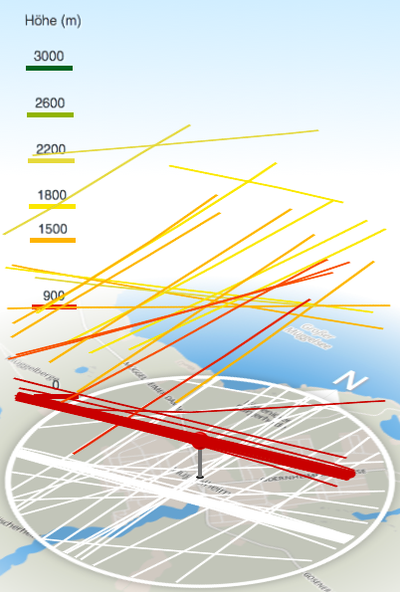
asf-3d-backgroundis a container for all the elements constituing the ground of the view: the background map tile image, the nord-indicator and the area circleasf-pin-containerwill house the pin pointer itself. The container will be needed for the sprite effectasf-legend-containerwill contain the altitude label sprites.
Map tile
While Google Maps was a quick and efficient solution for the prototype, it couldn’t be used commercially for this kind of application. So we switched to MapBox for all needed map issues.
For the ground map image we’re using MapBox tiles service. The service itself allows to request a static image centered in one point with specific coordinates and at a certain zoom level:
<img src="http://a.tiles.mapbox.com/v3/berlinermorgenpost.map-3uxbwdau/13.661954,52.412165,13/640x640.png"/>
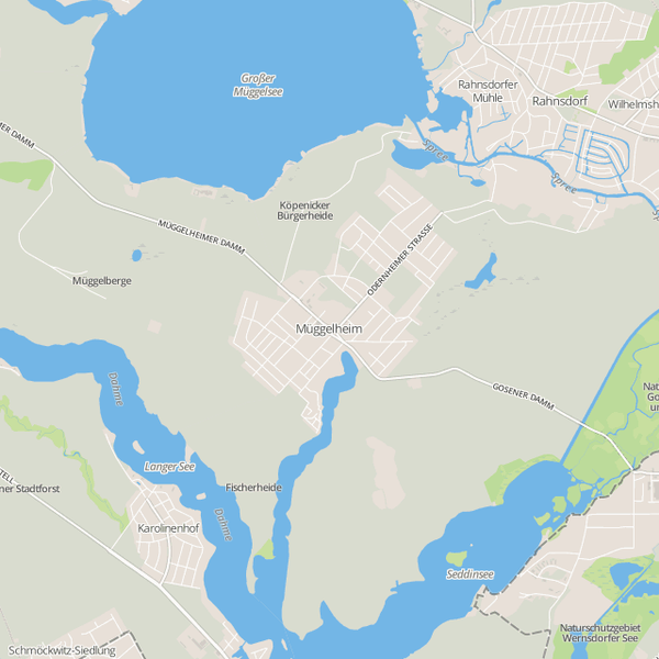
The URL is built in the template straight from the current selection model used by the view, via the coordinates mapBoxCoords and the zoom mapZoom.
640×640 is the maximum size provided by the service. The tricky point is that we need to cover a bigger area than the selection itself and the image needs to match the scaling of the traces, but 640×640 is too small, considering that our analysis area is 380px wide. As both the traces use the Spherical Mercator projection and same tile system as MapBox does, and keeping in mind that the area covered by a tile just doubles in size by reducing the zoom level by 1, we can get a larger but still in proportion image by simply reducing the zoom level by 1 compared to our traces. We then double the size of the container, keeping the covered area in proportion.
In the URL we asked for a zoom 13, meaning that traces’ zoom level will be 14. Knowing this fact, and knowing the original tile size (see above) we can calculate the size and the offset that the background image should have: .
.asf-image-container {
  // Size of the trace layer in pixels.
  // This is the width of an area in pixel cover by a 2km radius at
  // zoom level 14.
  $pathTileSize: 380px;
  $mapTileSize: $pathTileSize * 2;

  $tileOffset: $pathTileSize/2;
  z-index: $zBackground; // A lower z-index than the rest of the layers
  width: $mapTileSize;
  height: $mapTileSize;
  left: - $tileOffset;
  top: - $tileOffset;
  position: absolute;

  // expand the image to fill the whole container area
  img {
    width: 100%;
    height: 100%;
  }
}
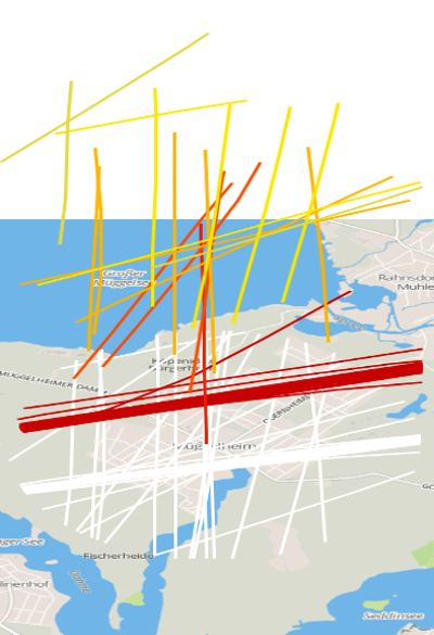
NOTE: to be fair, the size of the tile would need to be 760x760px, exactly double the size of traces’ container size. This is indeed a workaround for a proportion issue within the projector which we’re working out for the next update.
In order to fade out the background a bit, and reduce the ‘squared’ look, we used the :after pseudo-class to create an overlay mask with a radial gradient, transparent in the middle and white at the borders:
.asf-image-container {
  // …

  &:after {
    top: 0;
    right: 0;
    lef:0;
    bottom: 0;
    width: 100%;
    height: 100%;
    position: absolute;
    content: ' ';
    background-color: transparent;
    @include background-radial-gradient(50%, 50%, ellipse, closest-side, rgba(255,255,255,0) 56%, $white 100%);

    // Makes it visible on top of the tile layer
    z-index: $zBackground + 1;
  }
}
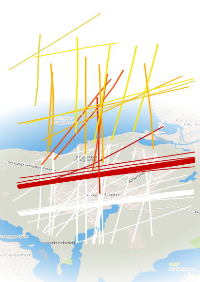
And the same approach goes for the border around the area, applied on the container this time:
.asf-3d-background {
  z-index: $zBackground;
  position: absolute;
  top: 0;
  bottom: 0;
  left: 0;
  right: 0;

  // Creates the ring
  &:after {
      $border-size: 6px;
      background: rgba(0,0,0,0.1);
      top: - $border-size;
      left:- $border-size;
      width: 100%;
      height: 100%;
      position: absolute;
      content: ' ';
      border: $border-size solid white;
      @include border-radius(350px);
      box-shadow: 0 0 15px rgba(0,0,0,0.3);

      // Makes it visible on top of the tile layer AND overlay
      z-index: $zBackground + 2;
  }
}
North indicator
Same principles work here as well. What we needed was a ‘N’ with an arrow pointing on the top. Once we got the layers in place, everything could be done via CSS:
.asf-north-indicator {
  bottom: 0;
  color: #FFFFFF;
  text-shadow: 1px 1px 3px $dark-grey;
  display: block;
  font-size: 40px;
  height: 100%;
  left: 0;
  position: absolute;
  right: 0;
  text-align: center;
  top: -67px;
  width: 100%;
  z-index: $zBackground + 2;

  // CSS triangle
  &:after {
    display: block;
    content: '';
    position: absolute;
    top: 53;
    left: 0;
    right: 0;
    margin: auto;
    width: 0;
    height: 0;
    top: 38px;
    border-left: 25px solid transparent;
    border-right: 25px solid transparent;
    border-bottom: 25px solid $white;
    z-index: $zBackground + 2;
  }
}
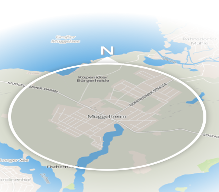
(The traces are hidden to better show the indicator)
Pin
This is one of the two ‘billboard’ elements we needed. We have to position it in the middle of our tile but we also need to rotate it in order to let it face the user and not just laying flat on the ground:
$pin-width: 26px;
$pin-height: 56px;

.asf-pin-container {
  width: $pin-width;
  height: $pin-height;
  position: absolute;
  top: ($pathTileSize - $pin-height)/2;
  left: ($pathTileSize - $pin-width)/2;
  z-index: $zPathsGround + 1;
  @include transform-style(preserve-3d);
}

.asf-pin-pointer {
  @extend .asf-icons; // includes the sprites background
  top: 0;
  left: 0;
  position: absolute;
  width: $pin-width;
  height: $pin-height;
  background-position: -4px -125px;

  // Rotates the pin toward the user and center the base
  @include transform((translateZ($pin-height/2 + 3) rotateX(300deg)));
}
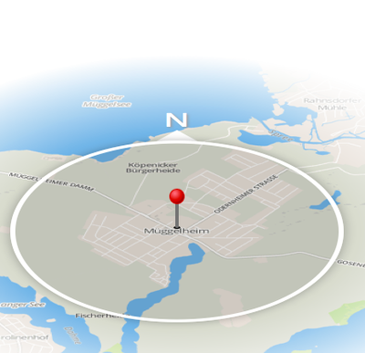
The useful fact here is that that container has not been rotated yet. This means that when rotating the rest of the view we can just rotate the pin container in the opposite direction, in order to mantain the ‘sprite’ look of the pin. We’ll see that later.
Legend
This is a bit trickier. The legend should work as a sprite, but it should be laying at the side of the circle. This is simply solved by moving the container on the side of the circle, and applying an inverse Z rotation to its content afterwards.
We first extend our markup to be like the following:
<div class="asf-legend-container">
  <div class="asf-height-marker">
    <span class="asf-height-marker-label">0</span>
  </div>
  <div class="asf-height-marker">
    <span class="asf-height-marker-label">300</span>
  </div>
  <div class="asf-height-marker">
    <span class="asf-height-marker-label">600</span>
  </div>
  <!-- … -->
</div>
Then we assign a translateZ CSS property to each one via Javascript in order to space them vertically.
Then we style it:
.asf-legend-container {
 position: absolute;
 width: 10px;
 top: 150px;

 // Move the container slightly out of the tile area
 left: -50px;
 @include transform-origin((25px 0 0));
 @include transform-style(preserve-3d);

 .asf-height-marker, .asf-height-marker-label {
   position: absolute;
   bottom: 0;
   top: 0;
   left: 0;
   right: 0;
 }

 .asf-height-marker {
   @include transform-style(preserve-3d);
   border-bottom: 9px solid;
   height: 20px;
   width: 45px;
   text-align: center;
 }

 .asf-height-marker-label {
   // Rotate the labels toward the user viewport
   @include transform(rotateX(300deg));
   text-shadow: 1px 1px 1px $white;
 }

 .asf-height-marker-altitude {
   width: 200px;
   border: none;
   text-align: left;
 }
}
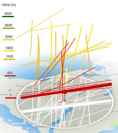
(the label color is assigned by Javascript, to match the same used by the traces)
Drag&Drop 3D Rotation
When the user drags the map, we need to pay attention to the billboard elements, so to keep them facing the user. We can accomplish this by rotating the sprite elements by the same amount of degrees, but in the opposite direction. For this purpose we defined this function in our view:
rotateMap: function(deg,initTransform) {
    var $labels = this.$el.find('.asf-legend-container'),
        $pin = this.$el.find('.asf-pin-container');

    this.$mapContainer.css('transform', initTransform +  ' rotateZ(' + deg + 'deg)');
    $pin.css('transform', 'rotateZ(' + -deg + 'deg)');
    $labels.css('transform', 'rotateZ(' + -deg + 'deg)');
}
For implementing the drag and rotate behavior we included the jquery.event.drag library which provides dragging events. This function binds the drag events on the viewport to the rotateMap function:
bindRotation: function() {
    var _this = this,
        dx, dy,
        currentTransform = this.$mapContainer.css('transform'),
        offsetX = 0, offsetY = 0,
        finalOffsetX = 0, finalOffsetY = 0;

    this.$3dViewport.on('draginit', function(e) {
        offsetX = e.pageX;
        offsetY = e.pageY;
        _this.$3dViewport.addClass('dragging');
    }).on('drag', function(e) {
        dx = finalOffsetX + offsetX - e.pageX;
        dy = finalOffsetY + offsetY - e.pageY;
        _this.rotateMap(dx%360,currentTransform);
    }).on('dragend', function(e) {
        finalOffsetX = dx;
        finalOffsetY = dy;
        _this.$3dViewport.removeClass('dragging');
    });
}
Then somewhere in afterRender:
_this.bindRotation();
Initial rotation
This was trickier, because jQuery.animate() cannot act on non-numeric properties such as trasform. The workaround to this, was to animate an unused parameters (border-spacing) and use the step function to rotate the map based on the interpolated value:
afterRender: function() {
    var _this = this;

    this.$3dViewport = this.$el.find('.asf-3d-chart');
    this.$mapContainer = this.$el.find('.asf-3d-chart-container');
    this.width = this.$mapContainer.width();
    this.height = this.$mapContainer.height();

    var currentTransform = this.$mapContainer.css('transform');
    this.renderLegend();
    this.plot();

    // Initial rotation is applied only if there are traces rendered
    if (this.model.get('count')) {
        // jQuery cannot animate non-numeric values by default
        // faking a border-spacing animation and rotating using
        // step function

        // Rotate the map first
        _this.rotateMap(90,currentTransform);

        // Set `border-spacing` to the initial rotation value
        this.$mapContainer.css('border-spacing',90);

        this.$mapContainer.fadeIn('fast').animate({

            // Animate `border-spacing` to the final rotation value
            'border-spacing':0
        }, {
            step: function(now,fx) {

                // Manually rotate the map at each step
                _this.rotateMap(now,currentTransform);
            },
            duration:2000,
            complete: function() {
                _this.bindRotation();
            }
        });
    } else {
        this.$mapContainer.fadeIn('fast', function() {
            _this.bindRotation();
        })
    }
}

